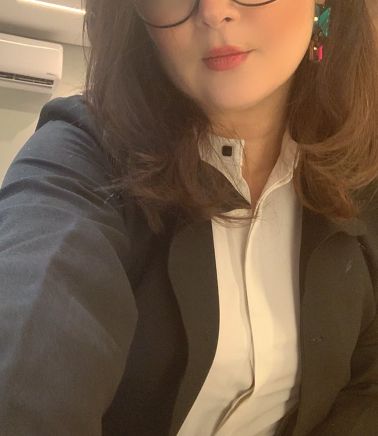
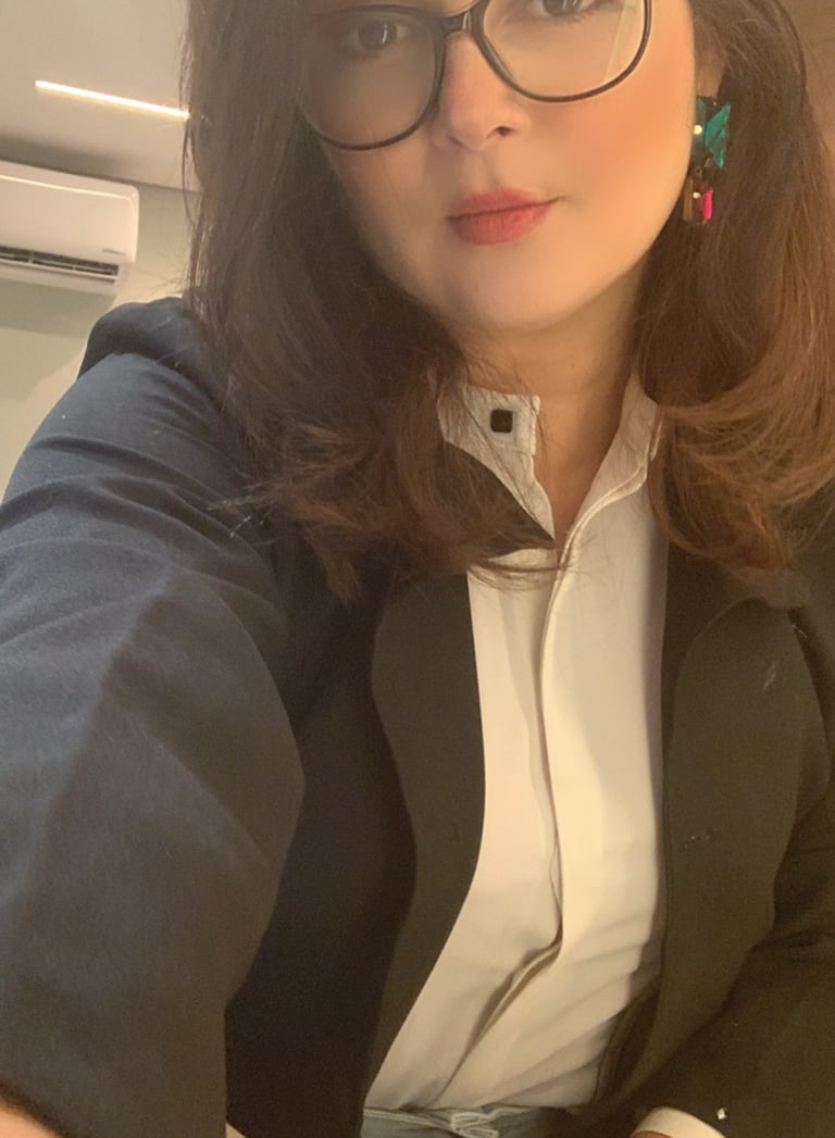
LIVIA GONDIM INTERIOR
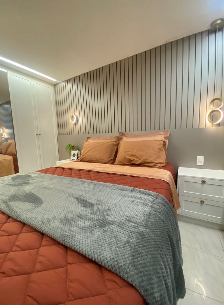
Livia Gondim is an interior designer with over 25 years of experience, delivering high-quality projects across Italy, Brazil, the US, Canada, and Portugal. Her work blends practical functionality, comfortable ergonomics, and sophisticated aesthetics, creating spaces that are not only beautiful but also sustainable in their maintenance.
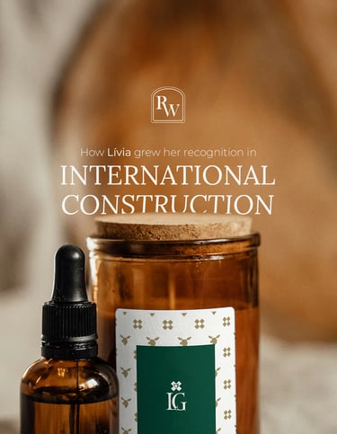


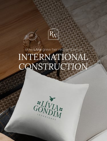
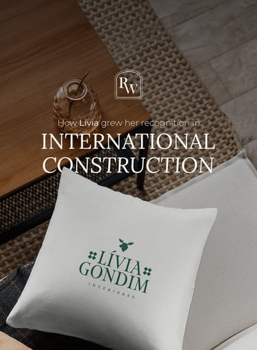
The project that won back the Interior Design clients in Europe & America after 25 years in the industry.

GRAPHIC DESIGN | COPYWRITTNG | WEB DESIGN | 2D ILLUSTRATION | CONTENT CREATION | VISUAL IDENTITY | ORGANIC MARKETING
LIVIA GONDIM INTERIOR
The project that won back the Interior Design clients in Europe & America after 25 years in the industry.
Livia Gondim is an interior designer with over 25 years of experience, delivering high-quality projects across Italy, Brazil, the US, Canada, and Portugal. Her work blends practical functionality, comfortable ergonomics, and sophisticated aesthetics, creating spaces that are not only beautiful but also sustainable in their maintenance.


GRAPHIC DESIGN | COPYWRITNG | WEB DESIGN | 2D ILLUSTRATION

Yet, despite her impressive compilation of projects, Livia found herself struggling with a lack of visual credibility.
Her clients often judged her before experiencing her designs & guidance within their realities, which resulted in a decrease in service requirements. They said her website had them thinking she "wasn't the best fit for their project because she doesn't seem to be aligned to the market's high quality" - (even asking her to reduce her fair price to feed their low expectations of delivery).
Livia realised that while her work spoke volumes, her brand didn’t reflect the same level of professionalism and quality. She needed a brand that would communicate her expertise and build trust at first sight with potential clients from the outset & reassurance from the ones who already invested and wanted to feel they were in good hands.
So we analysed the main aspects of that issue below:
PREVIOUS VISUAL IDENTITY
GRAPHIC DESIGN | COPYWRITTNG | WEB DESIGN | 2D ILLUSTRATION | CONTENT CREATION | VISUAL IDENTITY | ORGANIC MARKETING
Yet, despite her impressive compilation of projects, Livia found herself struggling with a lack of visual credibility.
Her clients often judged her before experiencing her designs & guidance within their realities, which resulted in a decrease in service requirements. They said her website had them thinking she "wasn't the best fit for their project because she doesn't seem to be aligned to the market's high quality" - (even asking her to reduce her fair price in order to feed their low expectations of delivery).
Livia realised that while her work spoke volumes, her brand didn’t reflect the same level of professionalism and quality. She needed a brand that would communicate her expertise and build trust at first sight with potential clients from the outset & reassurance from the ones who already invested and wanted to feel they were in good hands.
So we analysed the main aspects of that issue below:
PREVIOUS VISUAL IDENTITY
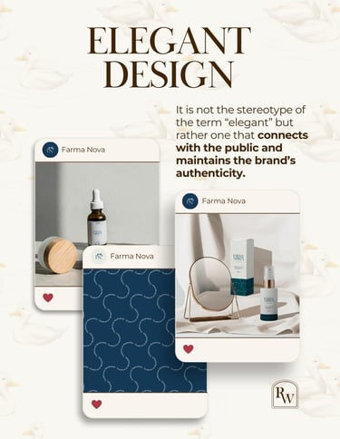
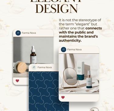
CONTENT CREATION | VISUAL IDENTITY | ORGANIC MARKETING


1 - Did not own a structured visual and behavioural strategy to build long-term connections with her leads;
Including the quick judgment element that is supposed to represent Livia's business at first sight, her logotype.
It didn't allow her leads to see their principles and dreams coming true. Although it sounds emotional for some, business is about people. People pay to either solve their problems or achieve their goals, and the first contact they have with a concept is through their eyes. It has to be pleasant and coherent to both the entrepreneur and audience, and neither of those was happy with it.
3 - Had as the foundation of her business identity only event & personal photos that wouldn't make her stand out as a professional, but as an amateur;
Which is perfectly good when the purpose is to convey humanity, access, and ongoing presence. However, it wasn't her will to show these aspects as a first impression before big companies, but a firm and admirable professional.
Knowing when, where, and how to intimately expose the nuances of your personality in business is an amazing marketing strategy to sell through authenticity. In this case, Livia's priority was to showcase her skills and experience.
2 - Presented only a few images of her projects without context and which show no value.
Since the client who looks for a professional does not always understand the reason for every choice made within limited resources, a few photos with no context meant no value and a sense of lacking skills. (which can be very frustrating for a 25 years of experience professional to deal with, and that does impact productivity, and of course, your revenue).
A big factor to consider when promoting your visual services in current days is to show how and why you're a better choice for positive results rather than Artificial Intelligence with actual data. In such an era, it is crucial to use it as a "time optimiser" tool instead of being entirely replaceable by it.
In this case, an architectural render can easily be made by AI. Exposing relatable human thinking with specialised skills to solve a problem is one of the very few keys to remain necessary to your client, and what AI can not do by itself, to this moment.


1 - Did not own a structured visual and behavioural strategy to build long-term connections with her leads;
Including the quick judgment element that is supposed to represent Livia's business at first sight, her logotype.
It didn't allow her leads to see their principles and dreams coming true. Although it sounds emotional for some, business is about people. People pay to either solve their problems or achieve their goals and the first contact they have with a concept is through their eyes. It has to be pleasant and coherent to both the entrepreneur and audience, and neither of those was happy with it.
3 - Had as the foundation of her business identity only event & personal photos that wouldn't make her stand out as a professional, but as an amateur;
Which is perfectly good when the purpose is to convey humanity, access, and ongoing presence. However, it wasn't her will to show these aspects as a first impression before big companies, but a firm and admirable professional.
Knowing when, where, and how to intimately expose the nuances of your personality in business is an amazing marketing strategy to sell through authenticity. In this case, Livia and her team's priority was to showcase her skills and experience.
2 - Presented only a few images of her projects without context and which show no value.
Since the client that looks for a professional not always understands the reason of every choice made within limited resources, a few photos with no context meant no value and sense of lacking skills.(which can be very frustrating for a 25 years of experience professional to deal with, and that does impact productivity, and of course your revenue).
A big factor to consider when promoting your visual services in current days is to show how and why you're a better choice for positive results rather than Artificial Intelligence with actual data. In such an era, it is crucial to use it as a "time optimiser" tool instead of being entirely replaceable by it.
In this case, an architectural render can easily be made by AI. Exposing relatable human thinking with specialised skills to solve a problem is one of the very few keys to remain necessary to your client, and what AI can not do by itself, to this moment.
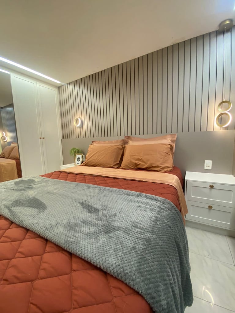
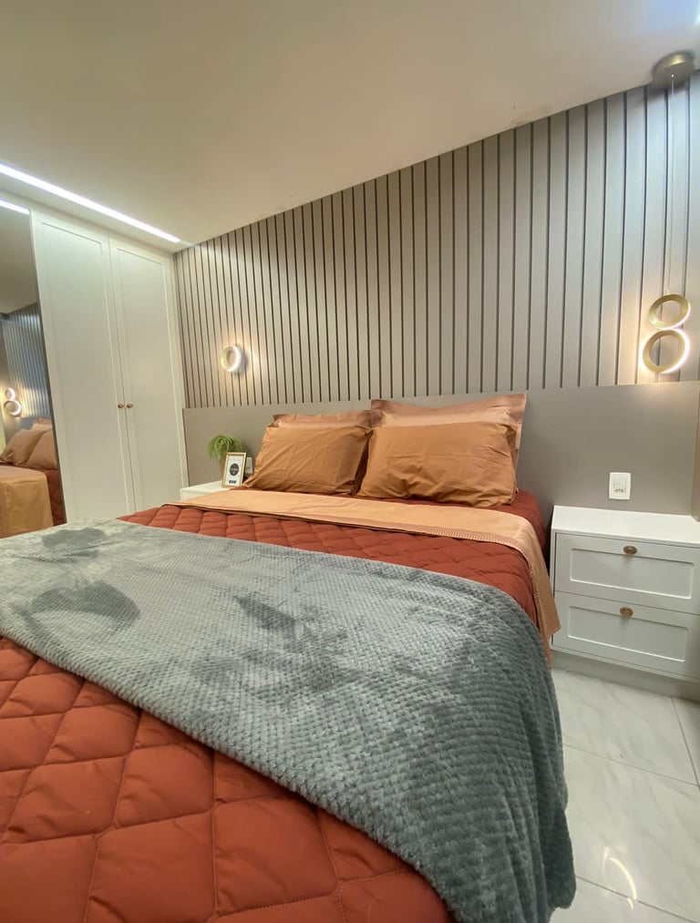
PRODUCTION
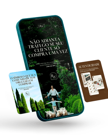
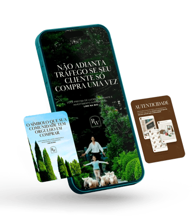
Through meetings and board approvals, we developed a new visual identity that aligns with Livia’s refined design approach.
Inspired by neoclassical, Scandinavian, and sophisticated architectural styles, we created a logo that speaks elegance and strength. Applying it to the brand's patterns, web design pages, social media templates with sales conversion script that represent expertise, was the breath of organisation and sense that Livia and her team felt in such a long time.
At this point, it's only fair that we show you some of our process in order to bring positive results for the same issues we found previously. You'll meet those below:
PRODUCTION
Through meetings and board approvals, we developed a new visual identity that aligns with Livia’s refined design approach.
Inspired by neoclassical, Scandinavian, and sophisticated architectural styles, we created a logo that speaks elegance and strength. Applying it to the brand's patterns, web design pages, social media templates with sales conversion script that represent expertise, was the breath of organisation and sense that Livia and her team felt in such a long time.
At this point, it's only fair that we show you some of our process in order to bring positive results for the same issues we found previously. You'll meet those below:
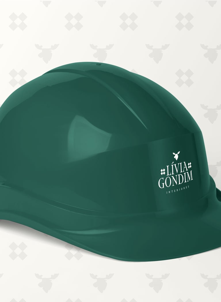
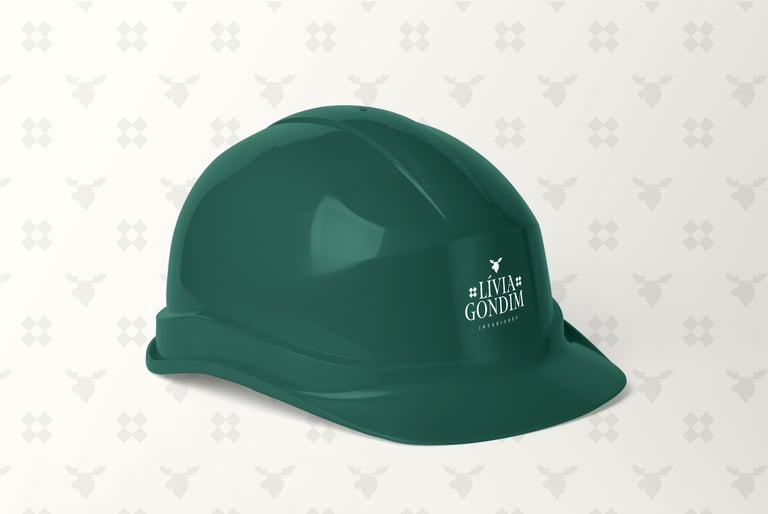
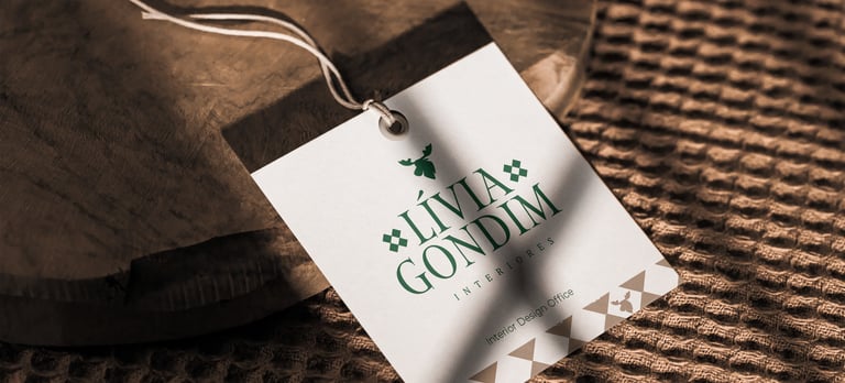
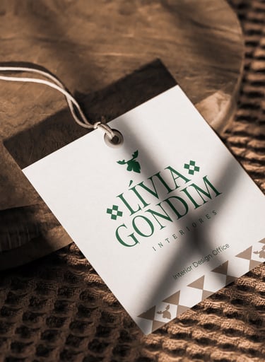
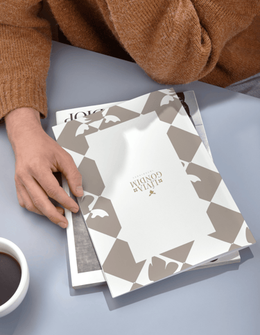
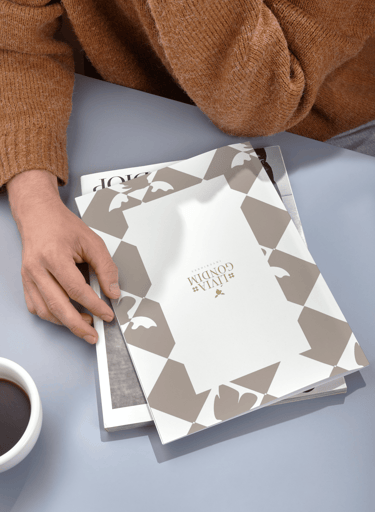
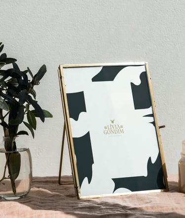
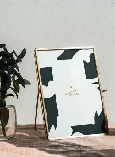
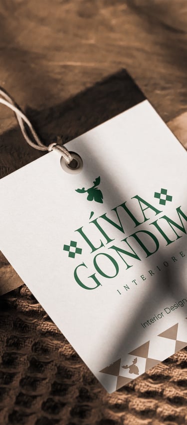
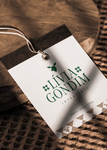
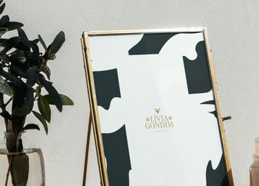
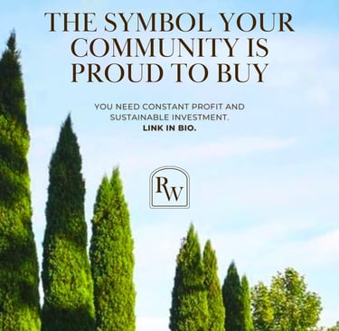
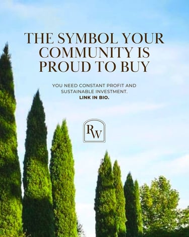
1 - A logotype that represents Livia's business essence at first sight;
The triangular-shaped logo with thin serifs embodies sophistication, while the primary green and beige colours convey a sense of sobriety and authority, as well as Livia’s connection to nature—an essential part of her design philosophy and appreciated by her past clients. A complementary beige palette adds warmth, reflecting the refined perspective that Livia brings to her projects.
To further represent strength and connection with natural textures and high contrast, we incorporated one of the classics, the moose symbol. The chess pattern, subtly used as visual balance to support the typo, brings out the high-level strategic thinking reference—a quality Livia consistently brings to her productions.
1 - A logotype that represents Livia's business essence at first sight;
The triangular shaped logo with thin serifs embodies sophistication, while the primary green and beige colours convey a sense of sobriety and authority, as well as Livia’s connection to nature—an essential part of her design philosophy and appreciated by her past clients. A complementary beige palette adds warmth, reflecting the refined perspective that Livia brings to her projects.

To further represent strength and connection with natural textures and high contrast, we incorporated one of the classics, the moose symbol. The chess pattern, subtly used as visual balance to support the typo, brings out the high-level strategic thinking reference—a quality Livia consistently brings to her productions.
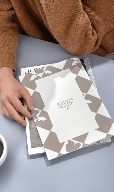
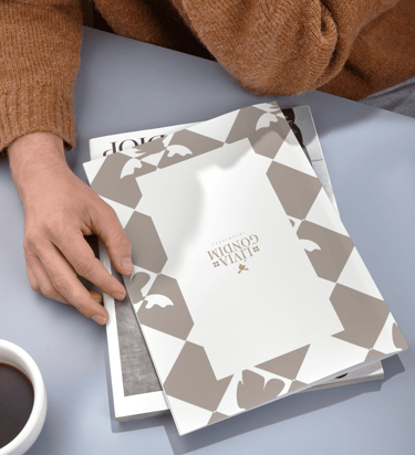
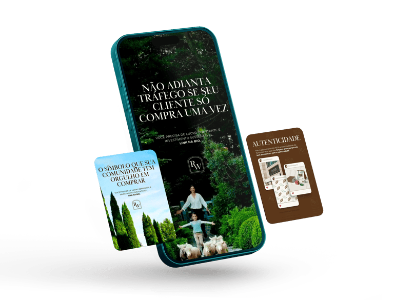
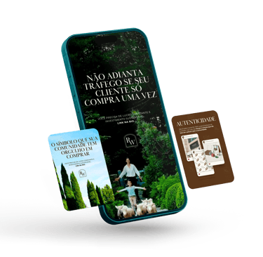
BRAND IN ACTION
Once the new identity was approved, we moved into implementation. We ensured that every part of the brand’s communication—from customer service to social media—reflected Livia Gondim Interiores' core values of elegance, function, and exclusivity.
The transformation was remarkable. Livia’s updated brand attracted new clients and earned her increased credibility within the industry. Her visual identity now acts as a powerful introduction to her work, establishing credibility even before clients experience her designs.
Over the past 23 years, this revitalised branding has helped Livia sustain her business and build a solid reputation as a trusted professional in the field. The exclusivity and trust conveyed through her brand have become cornerstones of her success.
Today, Livia Gondim Interiores stands as a symbol of prestige and distinction, inspiring clients to engage with the brand and experience the transformative impact of her design expertise, and she doesn't work overloaded with minimal prices. She's now able to work as much as she chooses with her team, charging her fair prices while gaining new leads constantly.
Today, Livia Gondim Interiores stands as a symbol of prestige and distinction, inspiring clients to engage with the brand and experience the transformative impact of her design expertise, and she doesn't work overloaded with minimal prices. She's now able to work as much as she chooses with her team, charging her fair prices while gaining new leads constantly.
BRAND IN ACTION
Once the new identity was approved, we moved into implementation. We ensured that every part of the brand’s communication—from customer service to social media—reflected Livia Gondim Interiores' core values of elegance, function, and exclusivity.
The transformation was remarkable. Livia’s updated brand attracted new clients and earned her increased credibility within the industry. Her visual identity now acts as a powerful introduction to her work, establishing credibility even before clients experience her designs.
Over the past 23 years, this revitalised branding has helped Livia sustain her business and build a solid reputation as a trusted professional in the field. The exclusivity and trust conveyed through her brand have become cornerstones of her success.
Today, Livia Gondim Interiores stands as a symbol of prestige and distinction, inspiring clients to engage with the brand and experience the transformative impact of her design expertise, and she doesn't work overloaded with minimal prices. She's now able to work as much as she chooses with her team, charging her fair prices while gaining new leads constantly.


"I'm thrilled. I can't find the level of this service in my city! Nivia, I can't stop looking at the visual identity it’s been 3 days now, it represented me so well! I'm already sending it to the office wallpaper print, everyone here loved it!"
"We can only thank you for the project that exceeded our expectations! Our team loved the visual identity, the work is excellent and the style represented us in an incredible way! We can not wait to print those out! It is amazing, thank you, Nivia!”
”Amazing! We loved the logo for our Canadian community! Perfect! We all like it. It was really good! No words! Shall we also produce a logo for our Portuguese version as well? That'd be great!"
TESTIMONIALS
Livia, Founder of Livia Gondim Interior
Lucas, Head of Marketing at UMP STUDIO
Matthew, COO of Cebrusa Agency
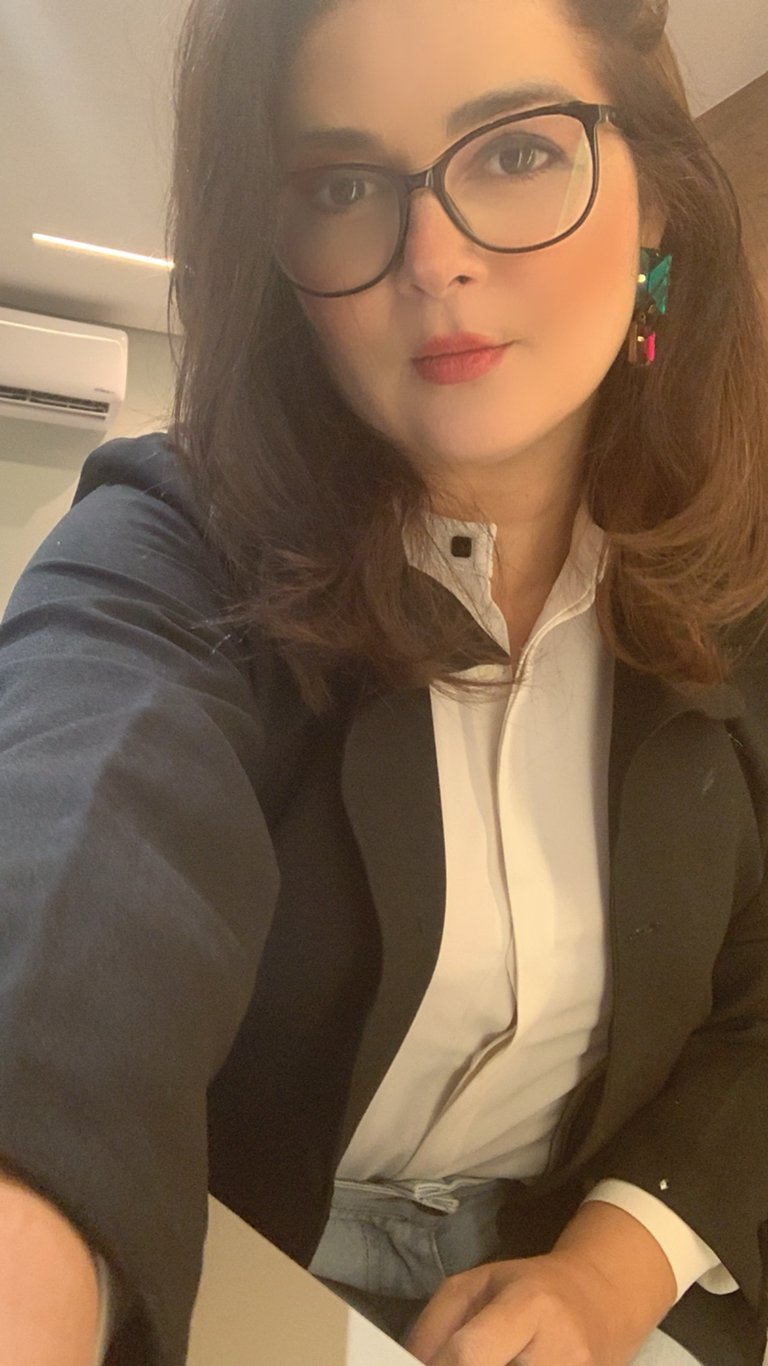
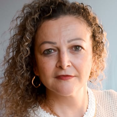
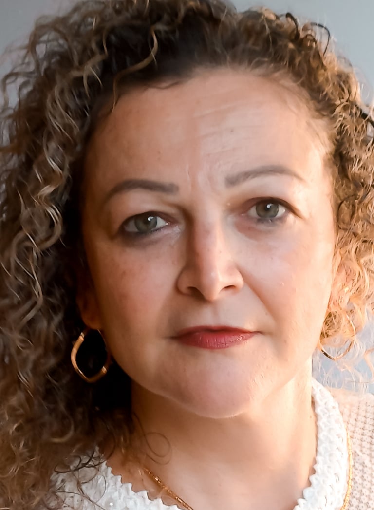
ABOUT NIVIA;
Nivia Wood is a married Senior Graphic, Web, Product Designer, Copywriter & 2D Illustrator based in Brisbane, Queensland. Australia.
With 5 years of global experience creating functional and artistic solutions through proactive communication and leadership across Australia, Canada, Italy, the United States, Brazil & Portugal.
Her approach combines creativity, function, and commitment to sustainable practices in Branding.
Nivia's goal is to transform non-authentic and unperceived brands into highly credible, audience-favourite choices through authentic storytelling and design that makes the audience feel proud of engaging with.
GRAPHIC DESIGN | COPYWRITTNG | WEB DESIGN | 2D ILLUSTRATION | CONTENT CREATION | VISUAL IDENTITY | ORGANIC MARKETING


"Thank you very much! I was lost and didn't know how to translate what I would like to convey elegantly and delicately and what you did was MUCH better than I could imagine! My team loved it! I'm super excited to launch the new visual identity!"
”My clients loved our new skincare collection! Especially the packaging design we created together! The cream is clean, smells great, and is very moisturizing! My clients asked us to do it in the larger packaging version too!
When can we start it?"
"I really liked it! Very practical to send the digital catalogue now, it will help the team in the costumer services! I noticed more organization in the Instagram feed and it was beautiful. I'm going to plan my schedule now to use the content we've created together."
TESTIMONIALS
Patricia, Founder of Patricia Encanta
Jessica, Founder & CEO of Stronda Cosmetics
Carol, CEO of Vidas Gerais Café
ABOUT WORKING WITH NIVIA;
With half a decade of global experience, Nivia Wood operates at the intersection of branding, UI/UX design, illustration & content strategy—helping businesses build authentic, high-performing brands rooted in visual storytelling and strategic thinking.
Her multidisciplinary approach blends creativity with functionality across digital and physical platforms. From developing user-centred interfaces and SEO-optimised websites to designing immersive brand identities and editorial illustrations, Nivia ensures every touchpoint aligns with market behaviour and emotional connection.
She is proficient in a wide range of tools, including Adobe Creative Suite, Figma, Autocad, Canva, Procreate, Paint Tool SAI & more—allowing her to bring each concept to life with both precision and personality. Her work spans everything from digital campaigns and product packaging to social content and full-scale brand systems.
By combining design expertise, marketing insights, and a deep passion for people, Nivia transforms brands into credible, community-driven entities that build long-term loyalty.


"Thank you very much! I was lost and didn't know how to translate what I would like to convey elegantly and delicately and what you did was MUCH better than I could imagine! My team loved it! I'm super excited to launch the new visual identity!"
”My clients loved our new skincare collection! Especially the packaging design we created together! The cream is clean, smells great, and is very moisturizing! My clients asked us to do it in the larger packaging version too!
When can we start it?"
"I really liked it! Very practical to send the digital catalogue now, it will help the team in the costumer services! I noticed more organization in the Instagram feed and it was beautiful. I'm going to plan my schedule now to use the content we've created together."
TESTIMONIALS
Patricia, Founder of Patricia Encanta
Jessica, Founder & CEO of Stronda Cosmetics
Carol, CEO of Vidas Gerais Café
ABOUT NIVIA;
Nivia Wood is a married Senior Graphic, Web, Product Designer, Copywriter & 2D Illustrator based in Brisbane, Queensland. Australia.
With 5 years of global experience creating functional and artistic solutions through proactive communication and leadership across Australia, Canada, Italy, the United States, Brazil & Portugal.
Her approach combines creativity, function, and commitment to sustainable practices in Branding.
Nivia's goal is to transform non-authentic and unperceived brands into highly credible, audience-favourite choices through authentic storytelling and design that makes the audience feel proud of engaging with.
GRAPHIC DESIGN | COPYWRITNG | WEB DESIGN | 2D ILLUSTRATION


"I'm thrilled. I can't find the level of this service in my city! Nivia, I can't stop looking at the visual identity It’s been 3 days now, it represented me so well! I'm already sending it to the office wallpaper print, everyone here loved it!"
"We can only thank you for the project that exceeded our expectations! Our team loved the visual identity, the work is excellent, and the style represented us in an incredible way! We can not wait to print those out! It is amazing, thank you, Nivia!”
”Amazing! We loved the logo for our Canadian community! Perfect! We all like it. It was really good! No words! Shall we also produce a logo for our Portuguese version as well? That'd be great!"
TESTIMONIALS
Livia, Founder of Livia Gondim Interior
Lucas, Head of Marketing at UMP STUDIO
Matthew, COO of Cebrusa Agency
ABOUT WORKING WITH NIVIA;
With half a decade of global experience, Nivia Wood operates at the intersection of branding, UI/UX design, illustration & content strategy—helping businesses build authentic, high-performing brands rooted in visual storytelling and strategic thinking.
Her multidisciplinary approach blends creativity with functionality across digital and physical platforms. From developing user-centred interfaces and SEO-optimised websites to designing immersive brand identities and editorial illustrations, Nivia ensures every touchpoint aligns with market behaviour and emotional connection.

She is proficient in a wide range of tools including Adobe Creative Suite, Figma, Autocad, Canva, Procreate, Paint Tool SAI & more—allowing her to bring each concept to life with both precision and personality. Her work spans everything from digital campaigns and product packaging to social content and full-scale brand systems.
By combining design expertise, marketing insights, and a deep passion for people, Nivia transforms brands into credible, community-driven entities that builds a long-term loyalty.
CONTENT CREATION | VISUAL IDENTITY | ORGANIC MARKETING